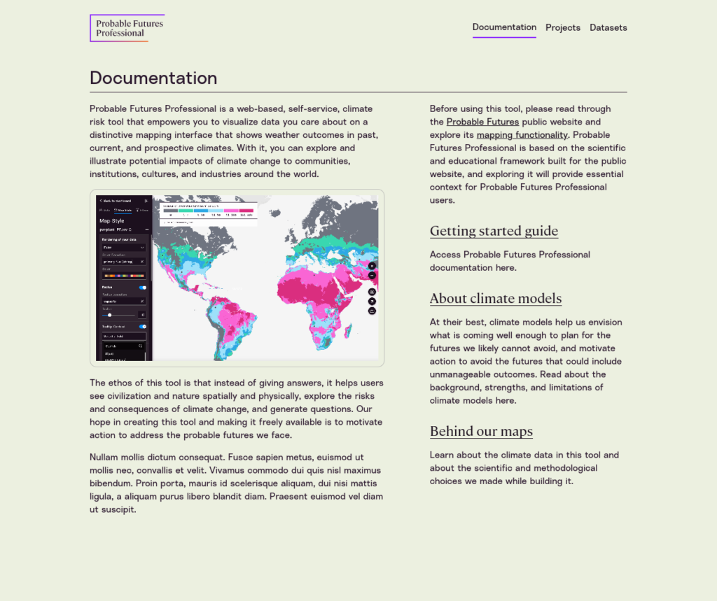
Probable Futures Professional
About Probable Futures
Probable Futures aims to increase the chances that our future is good. We offer useful tools to visualize climate change along with stories and insights to help people understand what those changes mean.
About Probable Futures Professional
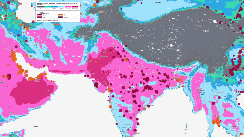
At a very high level, Probable Futures Professional is a tool that helps you turn this…
Into this:
Probable Futures Professional provides online tools that help you integrate your own data with climate change model data. This will allow you to identify key physical risks that might affect your organization and community.
Once you have enriched your data, you can explore it on a map, filter it, and easily share it. You can also download it for further processing. This documentation will teach you how to format your data, how to upload your data, and how to interpret the resulting maps and data sets.
Prerequisites
Skills and knowledge
This platform is built in conjunction with the public probablefutures.org platform, and uses the same data and mapping techniques.
Probable Futures Professional (PF Professional) is based on the scientific and educational framework built by Probable Futures, and exploring the site will provide necessary context for using it.
Before using this tool, please read through (or listen to!) the probablefutures.org website and explore the mapping functionality in that site. In particular, we highly recommend you read the climate models and our maps section of the site. This includes important information about the models and the data you will be working with in PF Professional. It’s important that you understand the strengths and limitation of climate data, especially if you plan to use it for decision-making.
System requirements
PF Professional is designed for use on a desktop or laptop computer with a modern web browser. Note that it will work on most modern machines/tablets, but it makes use of advanced technologies in the browser and will work better with faster computers with more memory.
It has been tested with recent versions of MacOS Safari, Google Chrome, Microsoft Edge, and Mozilla Firefox.
Telling a Climate Story (Read This Part)
PF Professional is an intuitive web app and you can skip this documentation and just play with the tool if you learn best that way. But please read this section even if you don’t read anything else.
This is a mapping and data tool, created by an organization focused on making climate change visible and comprehensible to as many people as possible. In short, it’s a tool created by climate storytellers, to make it easier for anyone to tell a good climate story.
Here are some thoughts on how to tell a good climate story:
Identify the dataset that matters to your audience
Your first task is to find a relevant data set. This means it’s relevant to your audience. It could be a data set of: Homes with mortgages, warehouse locations, where employees live, or poultry farms.
Climate change is a huge, complex subject, and overlapping climate events will be very destructive to our physical world and to human society. Don’t make it your job to prove that to your audience all at once. Take it a step at a time. With PF Professional you can start with small, practical topics and build to bigger parts of the story. If you need to build a SWOT chart, this is a tool that can help.
You might think that you only will have one chance to tell this story, but the reality is that climate change is here to stay, and you’ll be telling climate stories more and more as time goes on. We all will.
You might also think “we’re late!” That’s normal. For better and worse, that’s not true. In 2021, you’re very early to working directly with climate risk data in your analysis. You’re a pioneer and the skills you will develop in climate storytelling will be new ones.
Map and style your data in the context of a single climate variable
Climate transformation comes one step at a time. In your case this means taking it one climate variable (such as “number of days above 32°C”) at a time.
As of today, the key climate variable in PF Professional is heat, for which we offer 18+ different measures. Future modules will include drought and precipitation. As of now there is no plan to provide sea level data.
For example, you might want to estimate the increase in cooling costs for 100 refrigerated warehouses across the United States.
You upload a CSV with those warehouses and their addresses, and choose the “Number of days maximum temperature above 32° (90°F)” PF data set.
This will add climate data (specifically, a number of days) to each of your warehouses. Now what can you do? You can explore adaptation scenarios (what are we going to do to prepare for changes?) or mitigation scenarios (what can we do to stop emitting greenhouse gases?).
- Your first step could be to show these warehouses as dots on a climate map at different warming scenarios. You can do this by moving one slider in PF Pro. This helps people understand that different locations and different warehouses will experience different levels of heat risk as time goes on. Help them see this as something that is happening in the world.
- Do some spreadsheet work to estimate the increase in energy costs that should be expected across all of the warehouses, and put that in terms of kilowatt hours, or in terms of annual electricity costs.
- Zero in on the warehouses that will experience 90 days or more of very hot weather. You can filter out all the other warehouses and chart just the “hot” ones.
- Use the same data to point out that of the 5,000 people employed across those warehouses, 1,500 of them will be experiencing an increased range of health risks from the increase in heat, and argue for increased health-and-safety efforts for those employees.
- Finally, you might export the same data about energy usage into a spreadsheet and use that to calculate the likely future emissions of those warehouses and identify the costs and possible benefits of a transition to more solar energy and purchasing a different electricity mix.
Learning PF Professional
Our goal
We built PF Professional to give you the tools to add climate context to any data set you can imagine.
To learn how to use PF Professional, we’re going to load a data set with all the power plants in the world and enrich that data with climate change scenarios.
In particular, we want to know how hot it could get in a given region, in an average year, an unusually cool year, and an unusually hot year in different global scenarios. This will let us anticipate which power plants will be under the most pressure due to changing climate, both from the heat stress on power equipment, and from the increased need for energy to power cooling systems during extremely hot stretches of time.
When we’re done we’ll have an interactive map that lets us zoom in and out across the world, exploring the energy mix of different countries visually.
We will also have maps we can download and share (or tweet!) and a new CSV data set annotated with climate data. But first we need to start with the data. Let’s get going!
Preparing Data
Download a sample data set
We’re going to walk through a full example, using publicly available data, so that you can understand how the PF Partner Platform works.
The first thing you need to do is download the WRI Global Power Plants database. This is available at:
https://datasets.wri.org/dataset/globalpowerplantdatabase
This is an “ideal” Probable Futures dataset because it features tens of thousands of entries and they are all coded with latitude and longitude. Probable Futures Pro works best with below half a million data points.
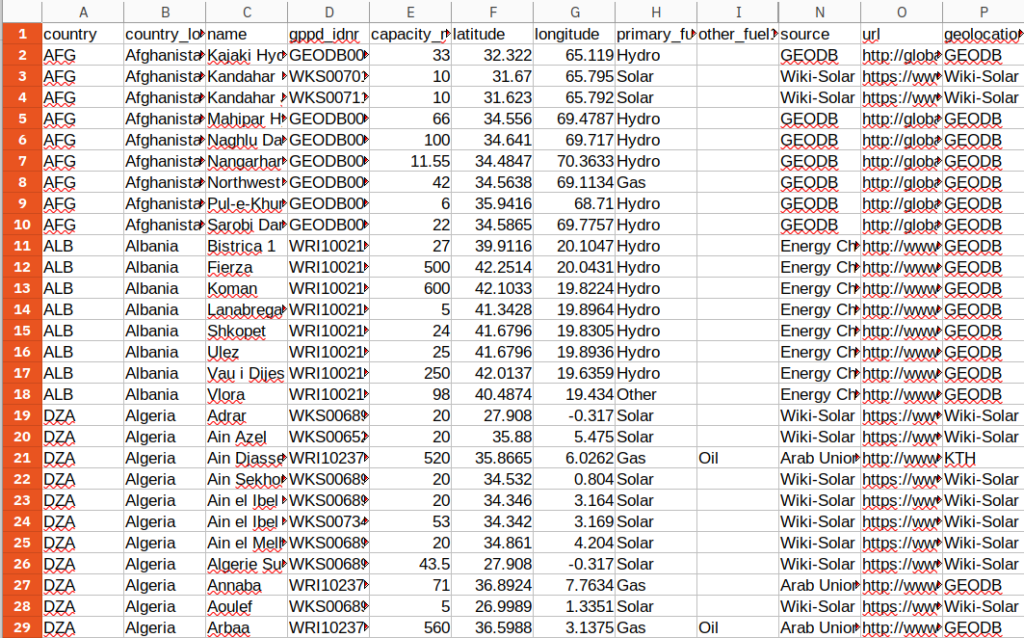
Open the ZIP file and save the CSV inside to your desktop. If you’d like you can open the CSV to look at the data. It should look like this:
Here are the critical things to notice about this data set:
- The WRI power plants data includes a header row that provides column names for all the rows inside the CSV.
- Each row has fields titled “latitude” and “longitude”.
Rename key fields
- The column name “latitude” needs to become lat and “longitude” needs to become lon.
- Once you’ve renamed the columns, export the file (make sure to export a CSV).
You have now downloaded a sample data set and are ready to login and use PF Pro.
PF Professional Basics
Login to PF Professional
You should have received an email from @probablefutures.org with login information. You will only be able to log in with the pre-authorized email address.
Visit the website https://professional.probablefutures.org and click sign in.
You’ll be given the option to sign in using your email address and password, or you can log in with your Google account.

Follow the login flow and authenticate with the platform.
First we need to start with the data. Let’s get going!
Create Your First Project
The default landing page is the “Documentation” page.
From there you can visit the “Projects” page. Think of projects as simple folders that can hold multiple maps and data sets.
The critical fact about a Project is that it can be shared with others easily.
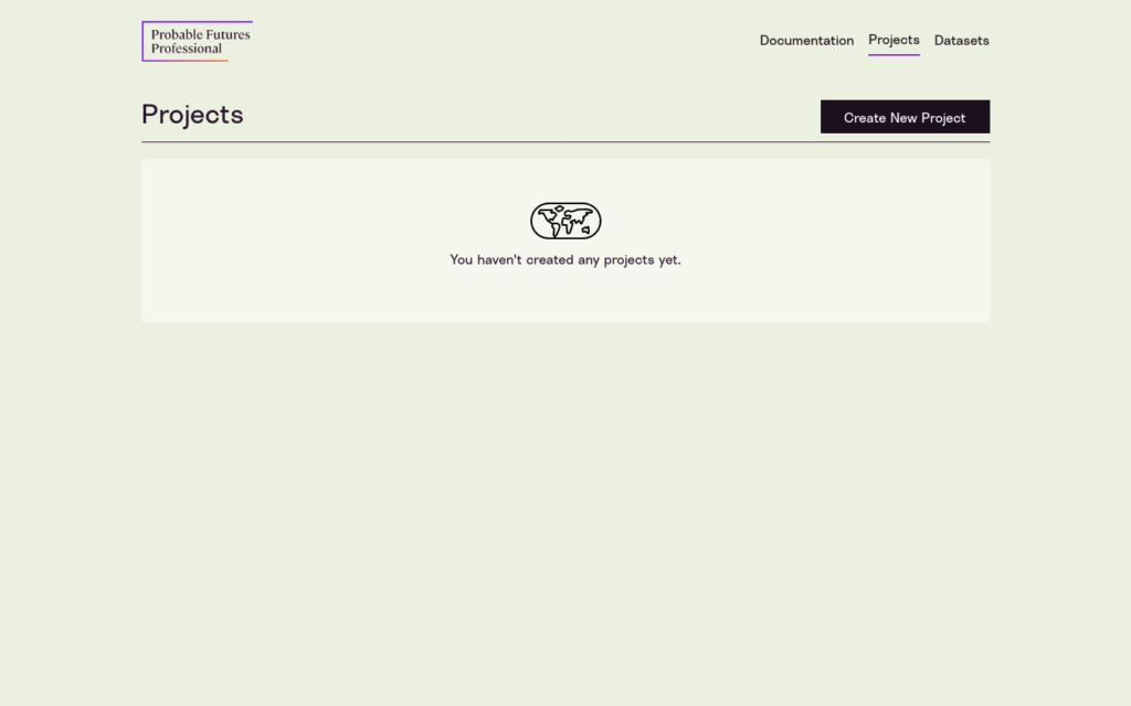
Your first task is to name your project. Click on “Create New Project.”
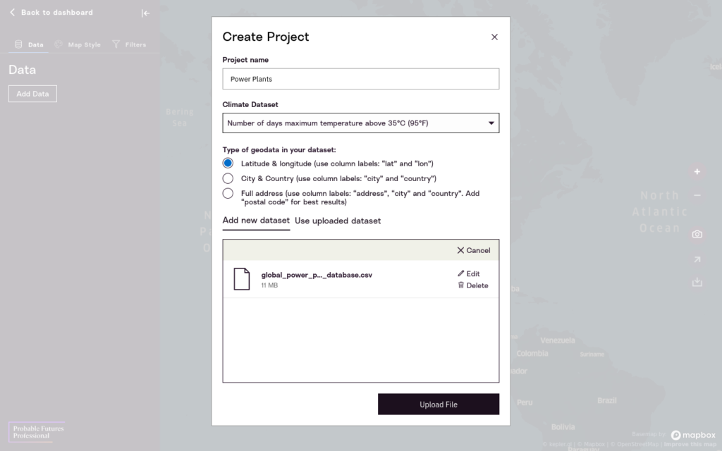
Name your first project “Global Power Plants” and click “Add Data”.
Adding data from a file
Your next step is to upload the CSV file you saved.
- First, select the climate data set you want to work with.
- Next, drag the CSV from your desktop into the upload area.
- It’s all done. Now click Upload File.
This will start a two-part process. First, the data will be evaluated line-by-line to make sure that it contains geographic information.
You’ll receive a notice with the number of accepted and rejected rows. In this case, 100% of the rows are valid.
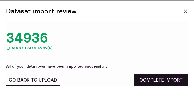
As we saw, the WRI power plants data includes a header row that provides column names for all the rows inside the CSV. Since each row has fields titled lat and lon, and those latitudes and longitudes are valid values, every row is registered as correct.
You can now click “Complete Import” and the system will enrich your data with climate data from the PF Professional dataset. This will happen without further interaction from you.
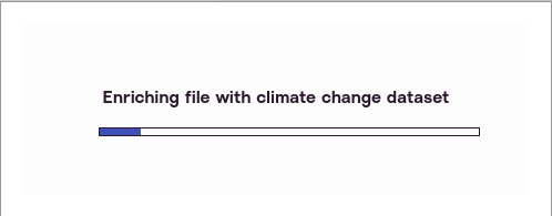
When it is done, it will open up the map in Dashboard view.

You have now uploaded data from a file, and you can move on to working directly with your data.
Under the hood
PF Professional is a geographical information system, so only data that has geographic information, such as latitude and longitude, or address information, can be evaluated.
This will go through three steps:
- Uploading. This usually only takes a few seconds on a fast connection.
- Validation. Each row will be checked for valid geographic data.
- Enrichment. Each row will be connected to climate data.
While there is no hard limit on the size of uploaded data, the system will slow down after a hundred thousand rows. As you’ll see the power plants data set is fast and responsive with about 34,000 rows.
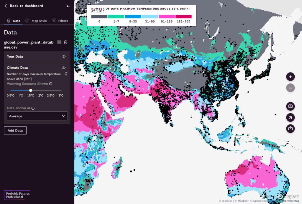
Map View
Let’s look at the three different interfaces in the Map view.
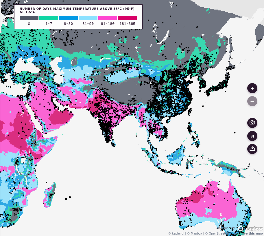
Map. The first element is the Map itself. This is a zoomable map with Probable Futures climate data overlaid, and your data appears as black dots on top of that map. On the right of the map there are interface tools that let you zoom in and out, download a screenshot, share a link, or download a dataset.
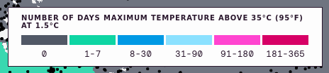
Key. At the top of the map is the Key. The key explains what different colors mean and provides an overview of the map.
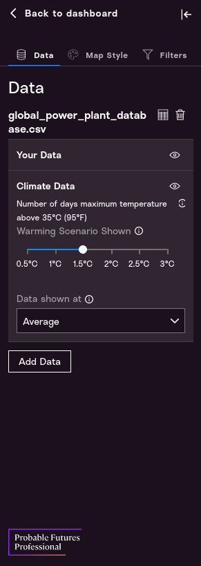
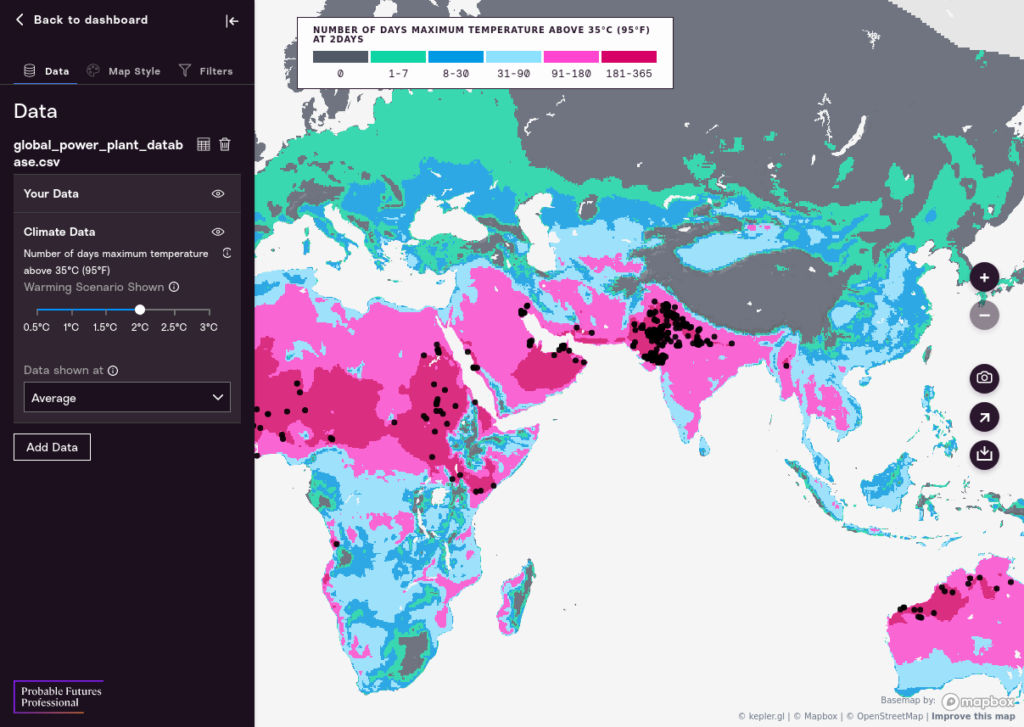
Control Panel. The Control Panel is where we work with and style the map. There are three major Tabs on the Control Panel: The Data Tab, the Map Style Tab, and the Filters Tab.
The Data Tab lets us choose which climate data scenarios we want to explore. In particular this lets us explore data at different Warming Scenarios. The numbers refer to degrees Celsius of warming above the stable global average temperature that Earth’s climate maintained for about 12,000 years up to 1900.
- The 0.5 warming scenario is representative of the climate at the end of the 20th century (1971-2000);
- The 1.0 warming scenario is representative of the recent climate (we passed 1.0°C in 2017);
- And each additional 0.5-degree increment represents higher levels of warming.
While many climate simulations forecast specific results for specific years, like 2030, 2040, and 2050, often based on specific emissions scenarios, we choose to use temperature instead. There are three reasons for this:
- We cannot say exactly when the earth will be at 2.0 degrees of warming, but the models are very good at generating a likely range of weather eventsat a given point on the earth at that global average temperature;
- Since climate models are not inherently time-based, but rather simulate the weather generated by a given atmosphere, forcing them to make time-based predictions generates distortions that then must be addressed with what is known as bias correction. Our approach avoids those biases altogether;
- We think it is useful to be able to understand scenarios that we can avoid. PF Pro maps go up to 3.0°C, a level that would cause massive climate instability and suffering. We hope that visualizing weather outcomes that level of warming will motivate action to mitigate warming.
- The Map Style Tab lets us style each dot based on our data. For example, a power plant with more megawatts of capacity could be shown as larger than one with fewer megawatts.
- The Filters Tab lets us filter our data to focus on just the parts that are most important to us. We could use this to filter out smaller values, or we could use this to filter by the most climate impact. We can also create dynamic filters based on different values in our data, like country names or other categories.
Let’s walk through each tab and style our data.
Data Tab
Choosing a Climate Scenario
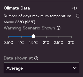
There are six scenarios. Probable Futures uses output from the CORDEX-CORE regional climate modeling framework. 1971-2000 is the earliest time period for which results are available from this set of model runs.
- 0.5. This is the average surface temperature from 1971-2000 relative to the years 1850-1900. This climate scenario also represents the climate that is familiar to most people alive today, i.e. it’s a “baseline” climate that you can compare to other climate scenarios to understand what has changed.
- 1.0. This threshold was crossed in 2017. Major biotic changes, including release of greenhouse gases from thawing permafrost, forest fires, and collapse of Arctic sea ice, have begun contributing to further warming.
- 1.5. Reaching 1.5°C is likely by 2030, and the probability of stopping warming below 1.5°C is approaching zero. Standards and expectations based on the past are rapidly becoming outdated. Heat, drought, deluge, and other stresses will increase, and large-scale biotic feedbacks are likely to intensify.
- 2.0. On the current path of emissions, 2.0°C will likely be passed in the 2040s. However, rapid, dramatic action to get to zero emissions can substantially lengthen the time before reaching 2.0°C, giving society and nature more time to adapt, prepare, and innovate.
- 2.5. On the current path, 2.5°C will likely be passed in the 2050s. The earth was last this warm nearly 3 million years ago, when there were no land-based ice sheets other than on Antarctica and Greenland. Stabilizing temperatures at 2.5°C would likely require humans to perpetually offset biotic sources of warming.
- 3.0. On the current path of emissions, 3.0°C will likely be passed in the 2060s. At 3.0°C, most regions of the Earth would have entered a different climate, causing severe biological disruptions. The climate is extremely unlikely to be stable at this temperature.
Choosing a Climate Probability Function
Climate models simulate weather outcomes around the globe. They are most insightful when used in ensembles, that is by running many models under slightly different conditions and parameterizations to create a set of simulated years. The range of different environmental characteristics (daily maximum temperature, precipitation, specific humidity) describe the state of the climate in any given location. PF has chosen to present several different outcomes and for each offers both the average or most likely condition produced by the model ensemble and the 10th and 90th percentile outcomes of the model runs.
If this material is new to you, we provide an in-depth discussion of how to interpret different percentile values when evaluating climate data on our core web platform, at in the “Science/Our Maps” section of the website.
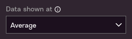
PF Professional data is derived from multiple climate simulations, and makes data available at three levels of statistical likelihood:
Average: What is the average of all the model outputs values? This can be thought of as the outcome in an “average year.”
10 percentile: What is the 10th percentile of model output values? For each cell on each map the models simulated many years (in most cases there are 126 simulated years). 10% of observations are below the 10th percentile, and 90% of observations are above it. As such, it represents a somewhat unlikely outcome. For example, if you are looking at a map of the number of days above 35°C (95°F), the 10th percentile would be the number of days above that threshold in an unusually cool year.
90 percentile: What is the 90th percentile of model output values? 90% of observations are below this level, and 10% of observations are above it. In the example above, the 90th percentile would be the number of days above 35°C in an unusually warm year.
Note that the 10-average-90 spread gives you a sense of the range of outcomes, but it is important to keep in mind that extreme values are outside of this range. One way to think of this is that while the 10-90 range includes most observations, 20% of all observations are either below the 10th percentile or above the 90th.
Developing an intuition about these values is important. Say that our variable is “number of days above 35°C (95°F) per year”.
We know from common sense that number could be anywhere from 0 – 365. At 2 degrees in a particular location we might see that:
- The Average is 60 days per year.
- The 10th percentile is 48 days per year.
- The 90th percentile is 94 days per year.
Therefore we can say, with confidence, “As we plan for the next ten years, we should absolutely plan for around two months-worth of (non-continuous) severe heat in any given year. However there is a reasonable likelihood that we will see ⅓ more hot days than even that on any given year out of the next ten.”
Be careful not to assign “10 percent” to “good” and “90 percent” to “bad” or vice versa. In the scenario above, smaller values are “better” and larger values are “worse”—but imagine a variable like “number of days below freezing” in an environment in which freezing days are critical to agriculture. In that case, smaller values are worse and larger values are better. Thus the “10 percent” value represents a significant risk in the future, while the “90 percent value” might be a “very good” scenario.
Map Style Tab
Rendering Data as Points or Heatmap
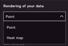
This menu allows you to choose how you want to represent a point in space.
Points. Most data will function best as “points” based on latitude and longitude, so leave the default option of “Point”.
Heatmap. However, if you would like to see the density of the data, the “Heatmap” option will enable you to see which clusters of points are near each other. For example, here is the “heatmap” view of power plants.
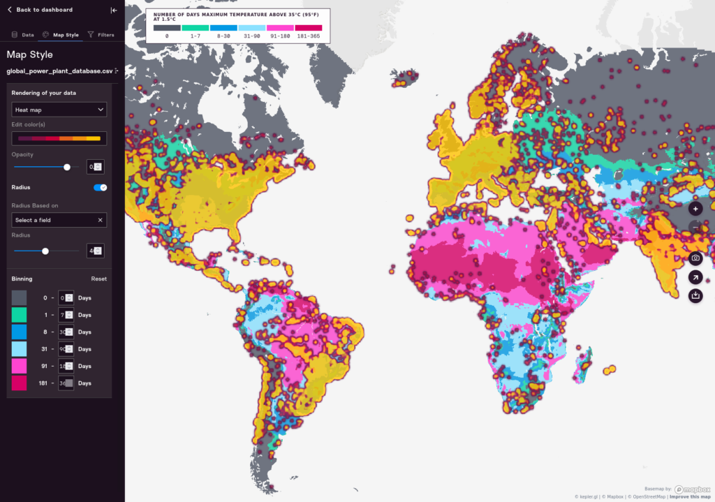
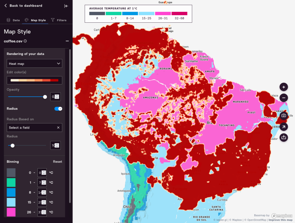
That basically shows the populated areas of the world, so it’s not all that useful. The Heatmap view can be useful if you have a grid that covers the entire earth or large regions, as opposed to specific places in time. For example, it is a good visualization to choose for datasets that show the percentage of hectares devoted to coffee cultivation everywhere in the world. Here’s what that can look like:
Coloring Data
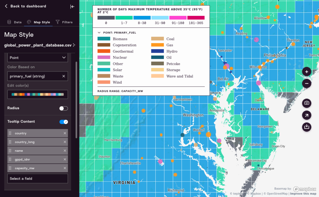
You can use the “Edit color(s)” dropdown menu to pick a different color for individual dots.
You can also choose any single column in your data and use that to set the color of dots. If you choose a numeric value (integer, real, or float) the color will be determined based on those numbers. More usefully, however, in our powerplants data set, we can choose a “string” value, and then color will be based on the unique values of the string. For example, we can color our data based on the kind of powerplant: Oil, Gas, Nuclear, etc.
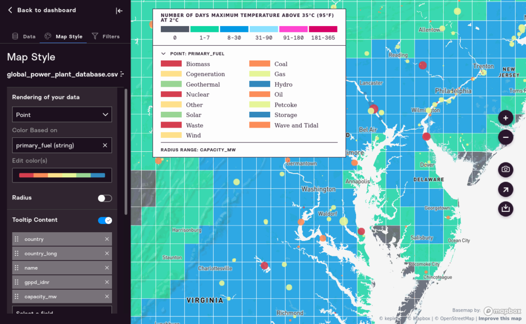
Take time to explore the way different options work. As you work with this tool you’ll find that some options make more sense with each other.
Color Ranges
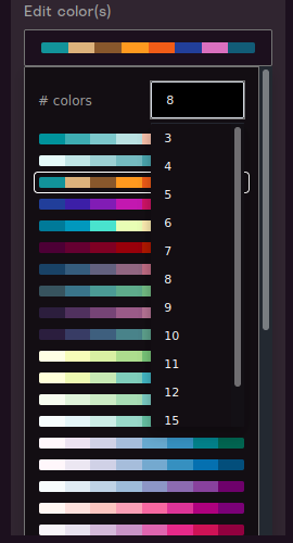
Per the above, you can choose color ranges that correspond to the values you set when you choose a coloring method.
Note that the default number of colors can be raised or lowered depending on preference. The current minimum number of colors is three and the current maximum is 20.
Setting Radius
You can change the radius of a dot based on a value in your data. Turn on the “Radius” toggle to see options.
Select a field from the “Radius Based on” dropdown. This will be used to determine the size of the point on the map. For obvious reasons, numeric values work better than string values.
In the example below it’s relatively easy to see at a glance all of the largest power plants, and how they are concentrated, in the eastern hemisphere.
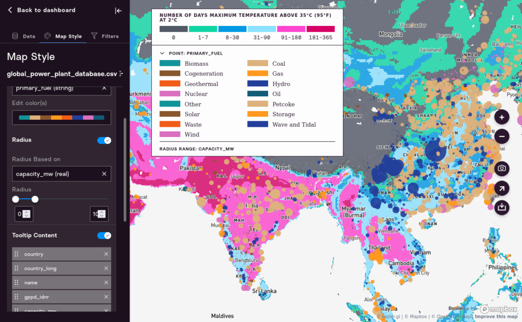
Once you’ve chosen a field for sizing, you can change the range of sizes. This can be useful as you’re zooming in and out of the map.
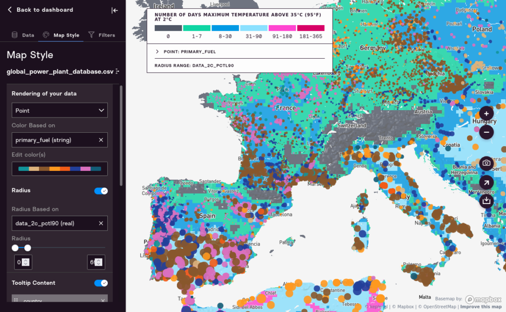
One interesting way to use radius is to make the radius of a point based on the 90th Percentile in a given global warming scenario, while basing the color of the point on some other field. This quickly creates a very information-rich map that lets you compare different risks in different areas (although such a map takes some explanation). However, below, once can see quickly, by the size of the dots, that the power plants of Italy and Spain, at the 90th percentile of 2 degrees Celcius global warming, will experience radically different climate outcomes than the power plants of France or Germany.
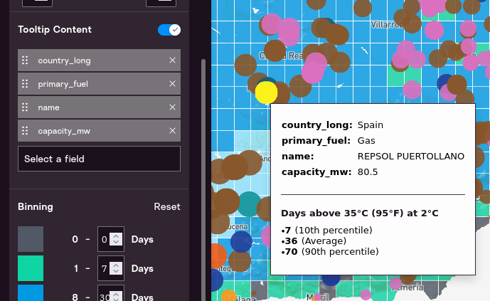
Defining Tooltips
When you put your mouse pointer over a point on the map, information about that point will appear. This is called a “tooltip.” This section allows you to define which fields will show up when the mouse is over its pointer in the tooltip. You can move items up and down and add fields. Below you can see how tooltip settings apply to tooltips.
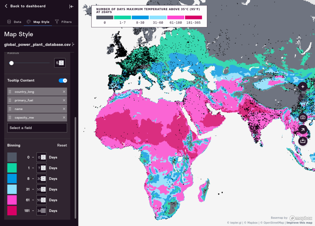
Binning
PF Professional allows you to change the “bins” that represent what the core colors on the map mean. Each map has a pre-set range that will serve as a default. For “number of days” variables, the default binning is:
- < 1 (Never),
- 1 < value < 7 (less than a week),
- 8 < value < 30 (between a week and a month),
- 31 < value < 90 (between a month and a season),
- 91 < value < 180 (three to six months),
- 181 < value (more than half the year).
You may find that different thresholds are more insightful or useful for the questions you are posing. If so, you can change the bins and recolor the map, which will also affect the map key and map coloration.
Here is the map with default binning:
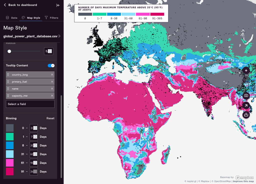
And, here, with the last two bins changed from 61-180 and 181-365, to 61-90 and 91-365, which changes the underlying map representation dramatically.
Filters Tab
Setting Climate Threshold
You can dynamically alter the climate threshold to show points on the map related to the climate variable on the map. For example, if you are exploring maps of hot days, you can move the sliders to show only the points on the map where it will be hot above half of the year.
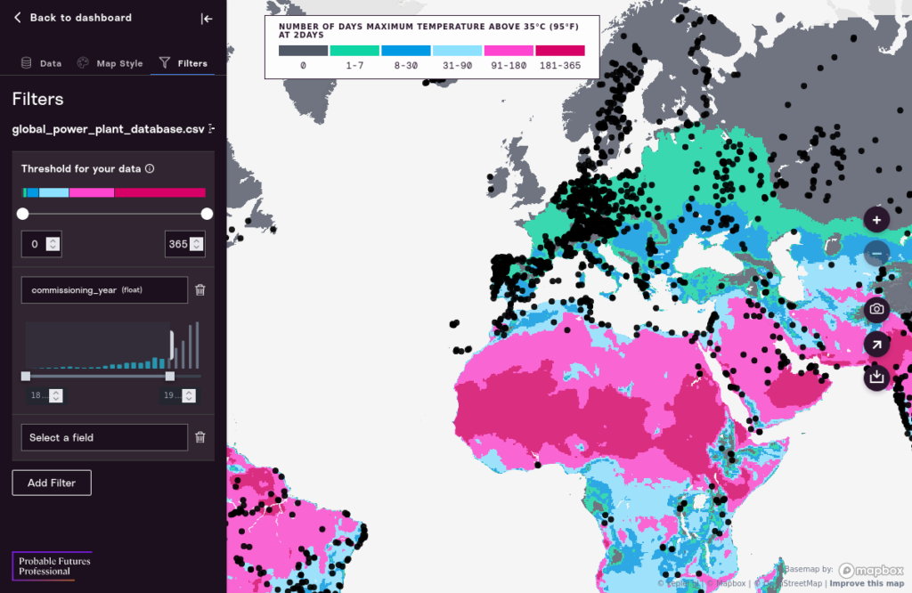
Adding a Numeric Filter
Clicking “Add Filter” will give you a dropdown list of fields. If you pick a numeric value, you’ll be presented with a histogram view that lets you filter based on value. For example, we can show only the power plants that have a commissioning_year below 2000, to identify older plants quickly. Moving the slider will dynamically update the map. Try it!
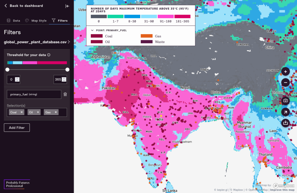
Adding a String Filter
String filters work differently. They provide you with the ability to filter on distinct string values in your data set. For example, you could show only the power plants that burn oil or gas, or only nuclear power plants. This will also update the map legend if you’ve defined the “Color Based On” color to be the same column in the spreadsheet as the one in your filter. See below for an example.
Sharing Your Work
Exporting an Image
Click on the “Camera” icon to export an image. This will provide you with a range of options for export and display.
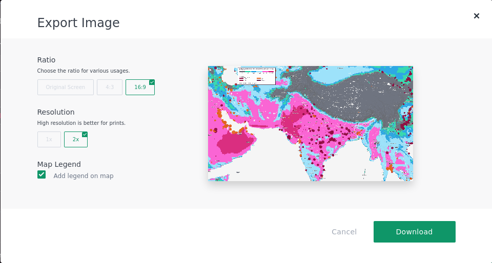
Images can be saved as PNGs and will be at a sufficient resolution for inclusion in presentations and slide decks. For example:
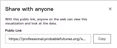
Sharing a Map
You can also share a styled and configured map by clicking on the “Arrow” icon. This will give you a custom, random URL that can be shared with anyone and will give them a view of the entire map and data. They will not have the ability to further customize the map.
Exporting Filtered Data
We can also export our data in basically the same format it was uploaded, but with columns added for the climate data. You can then download that for further analysis and processing.
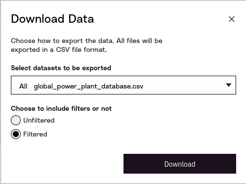
You can choose whether to download all of the data in your dataset, or just the resulting, smaller dataset that resulted when you applied different filters.
The data will come with a variety of columns related to the climate data you used to enrich your data. This columns will all start with the prefix data. For example, data_2_0_pctl90 refers to data for the 2.0 degrees Celsius global warming scenario, at the 90th percentile.
Conclusion
Probable Futures Professional is new software designed to be open-ended and flexible, while making it easy to see and comprehend any information set in the context of climate change. You are experiencing an early version of this tool.
We plan to continue development of Probable Futures Professional. As an early user, your feedback will be extremely helpful in guiding the next phase of development for this platform.
We welcome all feedback, whether praise, criticism, bug reports, or feature requests.