Greetings on this, one of the two most tilted days of the year. At midday the sun will be high overhead in the Southern Hemisphere, while here in the Northern Hemisphere even our noontime rays will arrive at sharp angles. Despite this difference we are all living on the uncaring terms of COVID-19. I am writing this letter as many communities face the onset of a grim winter of retreat and loss. Simultaneously, the prospect of imminent vaccines tantalizes us with visions of a life without encumbrance and isolation sometime in 2021. Perhaps in this uneasy atmosphere of fear and hope lies the ability to reinforce one thing we have all had to learn: the extraordinary power of small-sounding numbers.
Individuals’, communities’, and governments’ inability to understand, respect, and react to small-sounding numbers has been the main cause of suffering from COVID-19. Our ability to do much better in relation to climate change’s small-sounding numbers will be the difference between future generations living good lives while managing a challenging climate versus living from crisis to crisis at the mercy of an inhospitable, unstable, unmanageable one. A combination of fear and hope drive many of the people who have become part of Probable Futures, and each of us has had to learn and accept what small numbers can mean. Hopefully this letter will help you do the same.
In February I hosted a group of experts in ecology, energy, and risk at my house to discuss climate research and collaborations. The virus had just started being noticed outside of China, and during breaks in our session this group of highly numerate people discussed the possible trajectories. “The key number,” my friend Hamid said, “is the rate of transmission.” He had recently talked to an expert and explained to us how that number would determine if COVID-19 would stay contained or become a pandemic. A Rate of transmission (Rt) below 1 was nothing to worry about, while 3 would be globally catastrophic before summer. Having thought a lot about compound growth in other contexts, that sounded logical to me, but intuitively 3 still didn’t sound a lot higher than 1. A while later, as COVID-19 expanded rapidly, I did the following little exercise for myself:
If Rt is below 1, each person will, on average, pass it on to less than one person, so “the numbers,” as we all call them now, will keep going down. If Rt is greater than 1 the virus will spread. But all numbers above 1 are not the same. Every small increase makes a big difference. If Rt=1.1, the virus will spread steadily, so that if people are infectious for a week or 10 days, 1,000 cases will become around 2,000 over about 2 months, and 4,000 over 4 months. If Rt=3, however, it will spread so quickly it is hard to comprehend. One thousand virus carriers will infect 3,000 in a week or so, and within about two months there will be over 2 million cases. Another two such months unchecked and those 2 million would become between 4 and 5 billion, so essentially everyone in the world would have, or have already had, the disease. Looking back now at public data for the US, Rt was about 3 in mid-March as new daily cases went from a handful to 25,000. The week before this solstice Rt in the U.S. was estimated to be 1.16.
Climate’s small-sounding numbers
It is a coincidence that the key values for Rt match so elegantly to the small-sounding numbers that measure climate change. You have undoubtedly heard many times about “staying below 2.0°C” and “aiming to keep warming below 1.5°C.” Before I started on this work in earnest about 8 years ago, I had heard those numbers and not thought much about them. In fact, they sounded about the same. I would sometimes read articles or hear interviews with people who would say, “I estimate that we’re going to get to 3°C,” and think to myself, “OK, that sounds warmer than now, but not that much higher than 2°C, and 2°C is supposed to be safe.” Some economists posited that 3°C might be ideal.
Having spent a couple of decades studying economics, including 10 years deep in the arcana of Chinese statistics, I tend to be wary of information to the right of most decimal points, suspecting that precision is unwarranted. Clever econometric inquiries that produce sharp multi-decimal-point results are usually dependent on very specific conditions and “everything else being equal.” I brought that almost purposely imprecise mindset to climate work, and there are some ways in which it has been helpful, since measurement of the entire atmosphere is impossible and past records are imprecise. Now, however, I think about 1.5 and 2.0 all the time. I also think about 1.0, 2.5, and 3.0 a lot. Above 3.0 the numbers get very hard to think about. These numbers all mean radically different things, and everyone should have a sense of them. Between 1 and 3 are outcomes far more destructive than the ones COVID-19 could possibly have caused.
What—or when—was zero?
Before I get to the small numbers, I think it’s worth explaining zero. In COVID-19 terms, Rt=0 would be a virus that was not transmitted at all. What does it mean in climate terms?
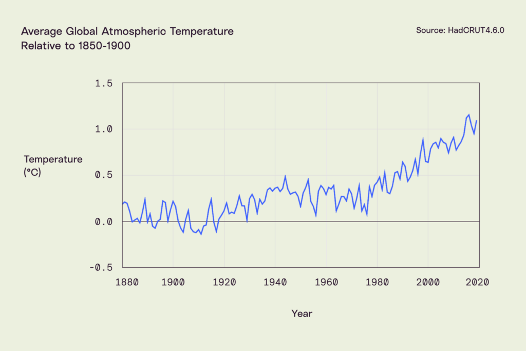
Zero refers to the “pre-industrial global average surface temperature.” Since coal- and oil-fueled industrialization took off around 1900, the common reference period is just before then. The Intergovernmental Panel on Climate Change (IPCC) uses 1850-1900 as its baseline, and most public discussion of global average temperature is linked back to that benchmark. Before then data is less comprehensive and consistent. The history of creating consistent and comprehensive data is a quiet one of volunteerism, curiosity, doggedness, and coordination.
People on land and at sea had been documenting weather for centuries, but temperature had been difficult to estimate before Daniel Fahrenheit invented his mercury thermometer in 1714. Even with accurate thermometers, however, global data was hard to collect and coordinate. In 1853 Matthew Fontaine Maury, the Superintendent of the Depot of Charts and Instruments (what a great job title!) of the U.S. Navy organized a summit in Brussels to set consistent standards for recording weather phenomena. This largely solved the consistency problem, but the aggregation and coordination problem remained. In the 1970s researchers at East Anglia University and the UK Meteorological Office began a painstaking project of going through past records from buoys, boats, and land stations around the world and putting them into a consistent usable format. Looking at these coordinated global records, we can now say that the average temperature of the atmosphere a meter or two above the surface between 1850 and 1900 was between 13°C and 14°C (55°F-57°F). Zero was comfortable.
I marvel at those efforts to collect weather conditions day after day because they bring together the mundane, daily observations of people all over the world over more than 150 years so that everyone can benefit from them. The simple act of paying attention and sharing observations has made our climate knowable. This is one of the many reasons that I have come to think that our ability to understand our physical environment is perhaps our species’ greatest collective achievement.
Where are we now?
When you encounter numbers like 1.5°C or 2.0°C in reference to climate change, they are measures of how much warmer, on average, the atmosphere near the surface of the Earth is—or will be—than that 1850-1900 average. In 1950-1980 that number was about 0.3°C. The average for 2019 was about 1.1°C. We won’t have final data for 2020 until sometime in January, but it looks as if 2020 will be the hottest year on record, surpassing 2016 when the cyclical El Niño phenomenon boosted temperatures above the upward trend.
When small numbers mean big change
There are a few ways that small changes in the average can lead to big changes in the experience of living on this planet, whether you’re a plant, a fish, or a community of humans.
Rare events become more common
Probable Futures is collaborating with a group called Ten Across out of Arizona State University. This connection has piqued my interest in Arizona. The populations of the state and its biggest county, Maricopa, continue to rise faster than all but a handful of places in the developed world. Arizona’s population has gone up 410% in the last 50 years, while the average temperature has risen by about 1.6°C (3.2°F). That temperature rise may not sound like much on the winter solstice, but in the spring, summer, and fall, it makes already hot days hotter.
Take 38°C (100°F). Even with low, desert humidity, that’s a hot day. In the 1920s Phoenix averaged about 75 such days, roughly 20% of the year. Between 1980 and 2010 the average was 110 such days, 30% of the year. This year there were 145, 40% of the year. Another 0.5°C higher and temperatures that only occurred in July and August will dominate May through October.
The changes at higher extremes are even more dramatic. Days above 43°C (110°F) used to be rare in Phoenix. A 1996 ASU study of Phoenix’s climate shows that from 1896 to 1995 there were on average 10 such days. By 2018 the record was 33 such days. In 2020 there were 53, nearly 8 weeks. 46°C (115°F) is brutal, and as one migrant out of Phoenix explained to me a few years ago, “Air conditioning can only lower the temperature inside a house by at most 30°F. At 115°F it’s brutal even inside a nice home. I had to get out.” Imagine living in one of the 85,000 mobile homes in Phoenix when it is so hot. The prior record for 46°C (115°F) days in Phoenix was 7. This year there were 14. As the global average temperature rises, these extremes will increase in frequency even faster.
The unprecedented starts happening… and likely never stops
Small increases in global average temperatures do not just cause the rare to become common. They also cause things that never happened before to occur. Consider the number of days when the temperature crosses 35°C (95°F). The first map in the animation below shows how often this happened in the years 1971-2000, when the atmosphere was at 0.5°C, followed by maps at 1.0°C, 1.5°C, 2.0°C, 2.5°C, and 3°C. The dark grey indicates places with zero such days in an average year. As global average temperatures rise by small amounts, the dark grey retreats quickly from big portions of Canada, Russia, Alaska, and mountainous regions around the world. The encroachment of green into these new regions is not just breaking temperature records. It is changing the physics of the tundra, especially the permafrost.
Number of days above 35°C
Twenty years ago, when global average temperature was about 0.6°C above the preindustrial average, scientists made a list of “low probability/high consequence events” that could be caused by warming. These “events” were the commencement of processes that, once started, would be essentially impossible to stop. Two such “high consequence” biotic processes were known to have the potential to create vast amounts of warming even if humans stopped emitting any greenhouse gases: widespread thawing of permafrost in Northern Russia, Canada, and Alaska, and large-scale forest fires, especially in dense tropical rainforests and big Northern forests. In each case, carbon that was held in dead organisms captured in frozen soil (permafrost) or locked into living plants and organisms (forests, including the carbon-dense undergrowth and soil) could enter the atmosphere either through melting and decomposing or burning. Once in the atmosphere, that carbon will trap more heat, in the case of methane, for decades. In the case of CO2, for centuries.
Seeing the animation of 35°C should lessen the surprise that widespread thawing is now underway. It turned out that 1.0°C of warming wasn’t harmless. Look also at the expansion of the pink color in South America where the Amazon is. The densest concentration of carbon in living things inhabits a specific climate that is under threat.
From almost never to almost always and nevermore
The Mediterranean Sea region is a crucial part of the world. Europe, Africa, and the Middle East meet there (Mediterranean translates to “between the lands”). Over 500 million people live in countries that touch this lovely sea. Its climate is special and specific: warm but not too hot; dry but with just enough rain to not be a desert. Mediterranean climate zones are found in a few places besides the eponymous region: South Africa, the southern edges of Australia, and California. These places have nearly identical weather (similar grapes grow in all of them) and are some of the nicest places on earth. Unfortunately, when a Mediterranean climate gets a bit hotter and a bit drier, it doesn’t become a bit less Mediterranean. It becomes a desert.
Below is an animation of the occurrence of extreme drought.Below is an animation of the occurrence of extreme drought. This is a drought that would theoretically have a 5.5% likelihood in a past climate (between 1971 and 2000).
Likelihood of extreme drought
Even the brightest yellow represents an annual 21-33% chance of a drought that was previously unthinkable. Since we have already passed 1.0, it shouldn’t be a surprise that plants that thrived in these climates for millennia are already exposed to more drought and much more heat. Fire seasons have lengthened and intensified. When the forests burn the same trees are unlikely to come back: it’s the wrong climate for them. They will be replaced by something scrubbier, or by the expansion of desert. For agriculture, industry, and residents, water is becoming increasingly scarce.
Yellow, orange, and red colors spread across the map at 1.5°C, 2.0°C, and 2.5°C. If we continue on to 3.0°C what was vanishingly rare will have become nearly constant. The Mediterranean climate only existed in a small number of places, and, unlike some other climates zones that can shift towards the poles with incrementally higher temperatures, this special climate will simply disappear from the face of the Earth.
Earlier I brought your attention to the Amazon. I would like you to look there again on the drought map above. Just as the Mediterranean climate is in danger, so too are the rainforests. Previously the only threat to these lungs of the planet was humans cutting them down for agriculture. Now, however, the risks are greater. Unprecedented droughts started occurring in the Amazon around 0.5°C. For the first time fires in Brazilian fields spread into the forests. Now that we have passed 1.0°C, drought is increasingly frequent and fires are becoming easier to start and more likely to spread. These great forests used to seem impervious and permanent. After just 1.0°C of warming they have become vulnerable. “Slowing deforestation” used to be seen as an environmental goal. We now need to not just slow or even stop cutting, but encourage the rebuilding of the forests while they still have the capacity to grow.
Thresholds, edges, limits
I think of the visible and invisible boundaries that surround us as edges. Some of these are obvious: the levees either keep the water out of the city streets or they don’t; precipitation comes as snow or as rain depending on the temperature; and the forest either is on fire or isn’t. Other edges are harder for us to see but are no less serious: the electrical system is either built to handle temperatures above 35°C or it isn’t; the storm sewer can handle 7.6cm (3in) of rain in 3 hours or it can’t; your kidneys and cardiovascular system can either handle a combination of heat and humidity called wet bulb temperature or they can’t.
Most coverage of climate change in the developed world has focused on sea level rise and storms. If sea level rise were the biggest problem caused by climate change, it’s unlikely that I would dedicate myself to the topic. Human society could retreat. It would be costly and unruly, but it would mostly be gradual. Unfortunately, sea level rise is likely the least damaging way that climate change will affect other species, the Earth’s systems, or civilization. Drought, fire, and inundation will alter much of the biosphere. Those factors will endanger people as well, but a combination of heat and humidity will likely be the most damaging to human life.
In the movie Jurassic Park the visitors get loose and spend time with the dinosaurs. This specific fantasy, of being a kid among dinosaurs, is remarkably common. What no one tells the kids, though, is that there is a reason there were very few mammals like humans around when the dinosaurs, reptiles, birds, and giant plants dominated: it was too hot. We generate a lot of heat, and we need to off-load that heat into the air around us. If the air is warm, we sweat, which accelerates the cooling (but requires us to take in more liquid). If the air is hot and humid, however, sweating is less effective. Wet bulb temperature is the reading on a thermometer wrapped in a wet cloth waved in the air. If the air is dry, as in Arizona, the cloth will dry quickly and will lower the temperature of the thermometer substantially.
26°C wet bulb is equivalent to 35°C (95°F) and 47% relative humidity. It is hot and sticky. It is dangerous to exert yourself at this temperature, and even a healthy person must stay hydrated to avoid health complications. This is a very hot, humid day in India, Nigeria, Florida, or in the Amazon. In such places this was strictly summer weather. In much of the world, especially Europe and the Northern US, this weather never happened. The expansion of yellow in the animation below is the extension of the hot weeks or month beyond 120 days, as the brutal summer encroaches on fall and spring.
Days above 26°C (78°F) wet-bulb
The health consequences of this map are somehow both hard and easy to imagine. Each of us has been uncomfortably hot and humid, so the sensation is familiar. But what if there was no relief? What if the air we thought of as hot and humid was actually not that bad? Probable Futures will share maps for higher wet bulb temperatures. Extreme wet bulb temperatures behave as do all of these climate phenomena: the rare becomes common and the unprecedented begins.
Coming back to zero
It seems very likely that COVID-19’s Rt will go back to zero or something very close to it in the coming years. Atmospheric temperature, however, will not go back to its stable 0°C level. The CO2 we put in the atmosphere will stay for centuries. The best we can do is stop the increases. And we can do that. We have to find ways to get the entire system, human and biotic, to zero emissions. If we had acted at 0°C, 0.5°C, or even 0.7°C, bringing human emissions down to zero would have stopped the process. Now that we are over 1°C, the tundra, glaciers, and forests have become unstable and are sources of warming. Thus to keep climate change from increasing, humans will have to plan and invest for life in a changing climate and work hard and fast towards a negative number.
Home maintenance
Referring to the Earth as “our home” can be a useful metaphor. Before massive, widespread industrialization, human society didn’t have to do anything to enjoy a stable climate. Our home was rent-free and required no maintenance. At 0.5°C we could have changed our behavior to limit risk and the depreciation of that home at a very low cost. Now that we are past 1°C, the atmosphere can still act as a home to civilization more or less as we know it, but like an old building exposed to inclement weather and salty air it will require unending maintenance and care. With each increment higher some of our neighbors will lose their homes. We don’t know enough to identify exactly at which number above that pre-industrial 0°C humans’ relationship with the Earth and atmosphere would become unmanageable, but the maps you’ve seen—and that Probable Futures will be sharing publicly—should make it clear that 3 is not a small number.
On our current path, 1.5°C will come this decade, with higher numbers not far behind. If we don’t act quickly, 3°C will likely come well before the end of this century. The best time to start getting to zero was 30 years ago. The next best time is now. We are perilously close to a point at which zero will no longer be possible and COVID-19 will seem like a quaint challenge.
Understanding, fear, and hope
I am sorry that this is a heavy letter at the end of a heavy year and the beginning of a difficult winter. I don’t want it to end on a sad or sour note, though. In fact, we at Probable Futures are hopeful. Hope is different from the optimism that thinks humans are so smart that they’ll figure it out, that someone else will take care of it, that you should “buy the dips,” or that the arc of civilization bends inexorably towards justice. The philosopher Jonathan Lear and the writer Rebecca Solnit have been helpful guides. Lear’s book Radical Hope studies Plenty Coups, the last great Chief of the Crow Nation as his tribe's traditions were outlawed. Lear marvels at Plenty Coups’s openness, flexibility, and “imaginative excellence” at a time when he couldn’t even see clearly what to be hopeful for. In Hope in the Dark, Solnit writes, “The hope I’m interested in is about broad perspectives with specific possibilities, ones that invite or demand that we act. It’s also not a sunny everything-is-getting-better narrative, though it may be a counter to the everything-is-getting-worse narrative. You could call it an account of complexities and uncertainties, with openings.”
We are still at small enough numbers to have vigorous hope. Indeed the process of getting to zero quickly could be a grand one, and even preparing for the higher numbers we can’t avoid is likely to have huge benefits. If we act quickly we can leave our children and those to come both a home that they can maintain and the physical, governmental, ethical, and imaginative tools to do that maintenance and live well.
Onward,

Spencer